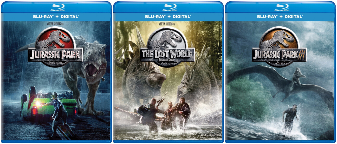
The Jurassic Park name means something – whether it’s the seal of quality only Spielberg can bring, pushing the boundaries of visual effects, or the iconic dinosaur designs. It’s a mega franchise running over 25 years if you count the novels, and its name is synonymous with quality. So why does the franchise seem to lack any real quality control (or at least the budget for good Photoshop artists)?

Welcome, to B-movie quality cover art park. To truly appreciate the travesties on display above, you should first look at them at full size and resolution, because the compressed picture just doesn’t do it justice. Snarky jokes aside, those covers just are not good – and for more reasons than poor photoshop skills.
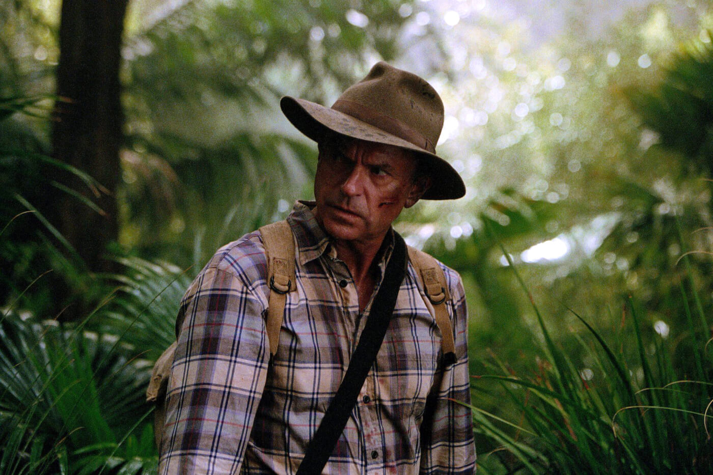
First up, Jurassic Park – conceptually it is a great cover (they all are – in concept), and Alan Grant and the Ford Explorer do look fantastic. Unfortunately, they look more like a previs concept. The Tyrannosaurus stands out of place, featuring a strangely modified male Tyrannosaurus head from The Lost World, not the female from Jurassic Park (plus it’s just poorly composited). In fact, the head used here is the bizarrely malformed head used on the 2015 Jurassic World products.

Wait. Is that a thumb on the Tyrannosaurus!? A moment ago we were going to point out Alan Grant wasn’t looking at the Rex, but now that issue seems Compsognathus sized. That’s not the only issue at play – the Tyrannosaurs right leg and foot are larger than the left, meaning they should be in front – however, the rear left leg has been photoshopped to land in the front.

The Lost World cover is plagued with just as many issues (ignoring the ugly logo, which would be an issue on its own). First off, the photoshop composition is just bad – which is frustrating, as the base image used (above) is a great choice. Of course the Stegosaurs pictured are far too large (even by The Lost World’s standards), but the idea behind the cover is fun. However, as Jurassic Park teaches us, intention doesn’t overrule execution.

The other issue is the two Stegosaurus’ on display aren’t from The Lost World: Jurassic Park – they’re the drastically different design from Jurassic World. In fact, the two renders on the cover are from Fallen Kingdom, and have already been spotted on early merchandise images. At least this can answer the raging question – do Jurassic World Stegosaurs have beaks like TLW and the real animal? Apparently not.

The Jurassic Park 3 cover is easily the least offensive. The composition of the overall image looks good, the Pteranodon is mostly accurate to the film, and it captures the feel of the movie. It’s just stuck with an ugly logo, and a really poorly photoshopped Billy Brennan face on the cover (perhaps he’s reacting to the other two covers).
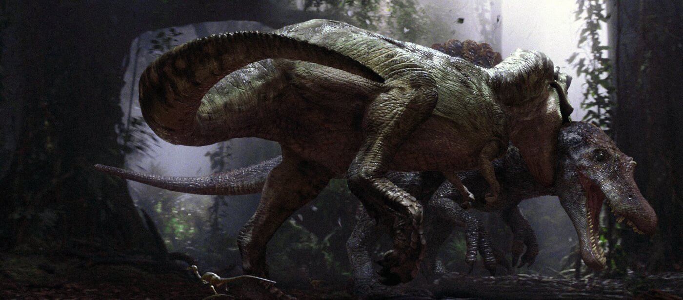
Minus the logo, this one at least looks like a professional film studio released it, even if it’s a bit sloppy. Though we have to wonder – why is it Billy on the cover (or wait – is that actually Nicholas Cage)? Further, why not the Spinosaurus? Those aren’t really issues, but the choices stood out as discussion points none the less.
It’s not just us scoffing at the new covers and initially questioning their legitimacy. In fact, the whole community seems to be having the same overall reaction:
For more community reactions see our Instagram, Facebook, and Twitter comments plus this Reddit thread.
So, how exactly did this new cover lineup pass quality control? While we can’t answer that, we can say it’s not the first time something like this slipped by for Jurassic Park. In fact, it’s not even the worst. The worst would be the 2013 Jurassic Park 3D IMAX Poster.

Art is subjective, but when it comes to meeting the quality and established designs from the base material, the line is crossed to objectivity. To be blunt, the poster and covers above are just not good. In fact, they’re awful, and a poor representation of the source material. This isn’t a case of a fandom entitlement complex (which is a real issue), but simply a poor look for the films overall. When talented artists put out better unofficial work on a daily basis, there is a big issue.
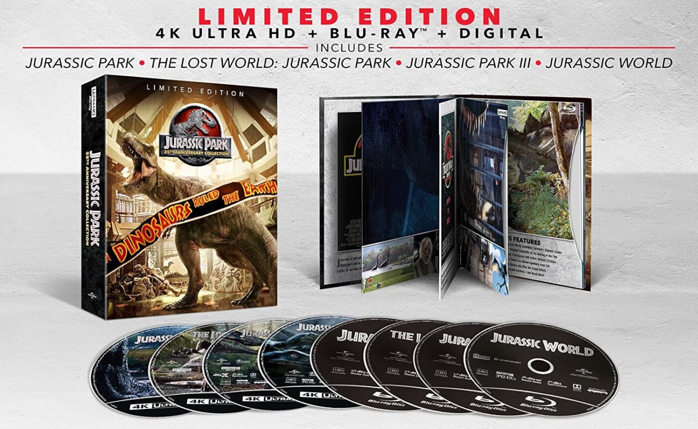
While the above artwork looks like it came from the studio that brought you Sharknado, the next point is something more subjective. The Jurassic Park 25th Anniversary key art looks more like a child’s coloring book cover than the celebration of the longstanding legacy of the film franchise.

The cartoony art style for the fossil backdrop is nothing at all like the visuals on display in Jurassic Park, nor does it mirror or celebrate the artwork used in 1993. 1993 used simple black backdrops, or the iconic jungle sunset motif. If they must insist on a fossil backdrop, at least go minimalistic and inspired by the pillars in visitors center (and actually illustrate dinosaurs depicted in Jurassic Park).

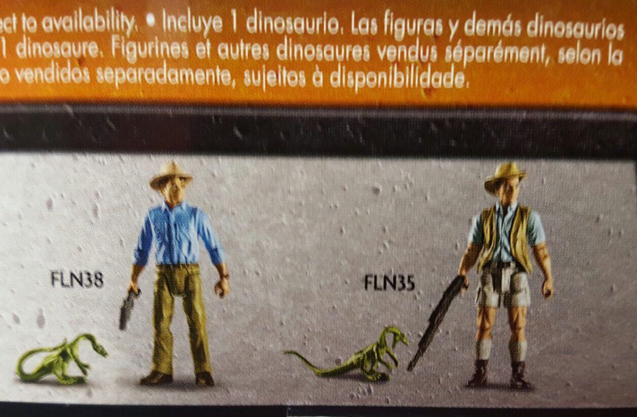
Though, as we said prior, this one is subjective – at least the artwork for Jurassic Park 25th looks professionally done, even if it does seem out of place. At the very least, it’s not another case of Velociraptor toys being released without sickle claws.

Nor are they the frog faced, green Jurassic Park 2011 Blu Ray statue (the original female Tyrannosaurus is brown, and certainly doesn’t look like this):

In the 2010’s the Jurassic brand hit an awkward stride, with products and images that don’t reflect the brand they belong to. With 2015’s Jurassic World, most chocked it up to rapid growing pains – but over two years later, the excuse seems a little less genuine. Perhaps a lack of a visual style guide and story bible has led an inability to properly vet creative outputs (but that doesn’t explain poor composition – that simply looks cheap and rushed).
This isn’t meant to be an attack piece – Universal Pictures releases some of our favorite films, and their offices are filled with talented, kind, smart, and enthusiastic people. This isn’t personal – just an observation of the some of the high profile Jurassic misfires. We digress. Rant over.
The Blu Rays are listed on Amazon.com, and judging by the back covers are simple releases of the other standalone Blu Rays, with no new content. Considering the cover art, these are easy skips, unless you’re an absolute completionist collector. If you’re on the market for Jurassic Blu Rays, be on the look out for these – they have great covers, and the same content:

This begs the question – if there is no new content on the Blu Rays, will Jurassic Park 25th Anniversary get its own release with new content in the coming months? The demand is there for a 4K release, and the 25th anniversary would the perfect time!
Sound off in the comments below, and let us know what you think of the covers! If you’re a photoshop wizard, perhaps you can take a stab at making your own custom covers and share them with us. As always, stay tuned for the last news – with the Jurassic World Fallen Kingdom trailer coming within a month, things are sure to get exciting soon.
Source: Amazon.com (Via @gencinexin and Blu-Ray.com)
