Hold on to your butts!
Universal Pictures have announced that starting in the Fall of 2019 there will be a live arena show called “Jurassic World Live“.

An official website went live this morning and it offers a brief description of what we can expect from the show.
An All-New, Live Arena Show Coming Fall 2019
Jurassic World Fans — get ready for this all-new, live-action show coming to your hometown! Experience the excitement of coming face to face with life-sized dinosaurs, including the vicious Tyrannosaurus Rex, the Velociraptor Blue and many other favorites. Adventure is guaranteed with arena-sized action, special effects and physical stunts that will leave you on the edge-of-your seat!

Our initial assumption and expectation is that this will be something similar to “Walking with Dinosaurs: The Arena Spectacular” that has been touring the world since 2007. But obviously this new show will be focused on the story and dinosaurs of the Jurassic World films. Check out the Walking with Dinosaurs video below of what the Jurassic World Live show may resemble.
However, despite some surface similarities it seems Jurassic World: Live will roar into new territories, pushing the boundaries of technology to bring the action to life like never before:
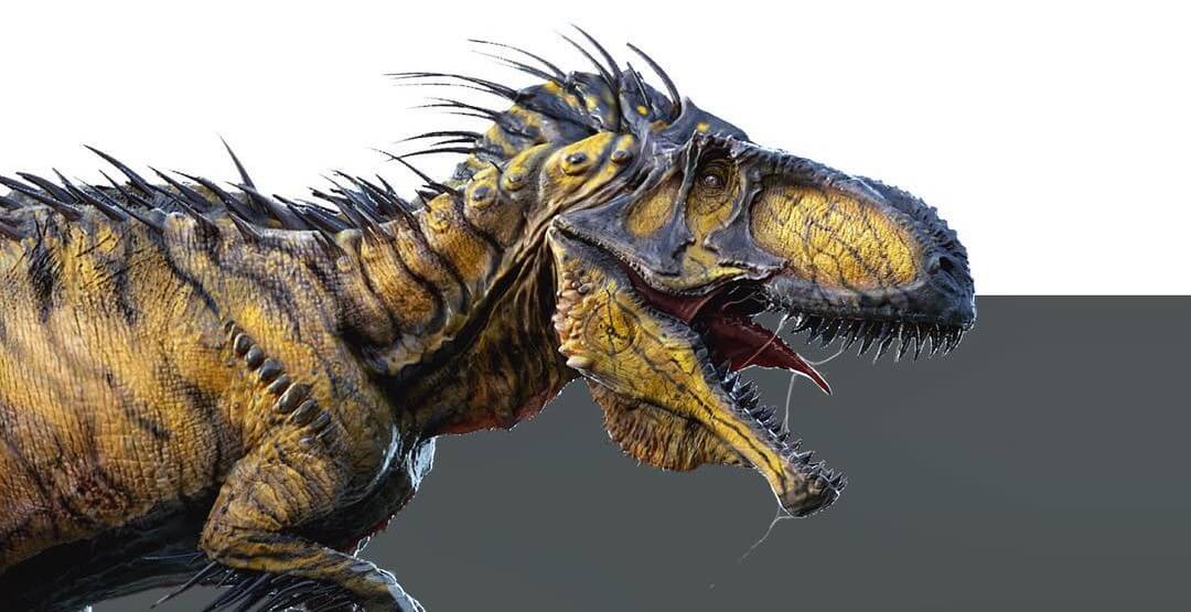
Feld Entertainment Inc. and Universal Brand Development are collaborating on a groundbreaking, live-touring show inspired by one of the biggest blockbuster franchises in cinematic history, Jurassic World. Feld will concept, produce and tour the multi-year arena show, which is scheduled to launch fall 2019 in the United States and will continue globally, featuring a herd of life-size dinosaurs extending up to 40-feet long. Using state-of-the-art projection mapping, fans will be transported right onto Isla Nublar, and with the addition of sophisticated animatronics and performer-operated characters, the dinosaurs will literally be the biggest stars of the show as the story is told through human and dinosaur interaction.
To bring this epic dinosaur world to life off the big screen, Feld Entertainment is breaking down the traditional arena barriers that typically exist between the audience and the live action. For the first time in an arena setting, fans will experience the epic wonder, thrills, awe and terror of the Jurassic World franchise up close and in their hometown.
“Fans around the world continue to tell us they want more ways to experience Jurassic World, and the thrilling action and larger-than-life experience of this live arena tour gives them the opportunity to engage in an all new and exciting way,” said Vince Klaseus, President, Universal Brand Development. “Feld Entertainment is best-in-class at creating spectacular live experiences, and this show is able to meet the high expectations of fans worldwide who are craving more interaction with Jurassic World dinosaurs.”
“The live Jurassic World arena experience will create new ways for fans to engage with one of the world’s most popular franchises,” said Kenneth Feld, Chairman and CEO of Feld Entertainment. “Feld Entertainment has the expertise and experience to bring this iconic franchise to life through an innovative format in an immersive arena setting coupled with a unique narrative that includes iconic locations and fan favorite dinosaurs – creating edge-of-your-seat, live entertainment that is a mix between a stunt show and a 3-D thrill attraction.“
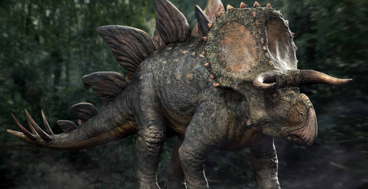
This show sounds quite different than Jurassic World: the Exhibition, the touring museum show which made its debut in 2016. While the exhibition has been met with enthusiasm from fans and families, one of the resounding comments is how the dinosaurs do not look like their film counterparts – perhaps the new live show will remedy this.
Are you excited for a Live arena show based on Jurassic World? Let us know in the comments below and on our forums!
Source: Jurassic World Live, PR Newswire
